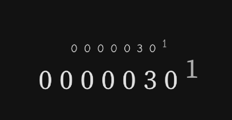
Another step forward in recreating the icon 90s website look is the hit counter, visitor counter or web counter in classic squemorphic odometer style.

I was inspired by a recent episode of Code with Italians where they animated a time field. I wanted to change the counter component to animate each number individually to get that odometer look.
Before doing this though there was a question of state. I wanted to make a counter that would auto increment in a coroutine. It had to change direction up or down if you tapped it. To do this I decided to store the state and the counting direction in a view model. This allowed me to keep the components as stateless as possible. The components are re-usable because the logic that makes the numbers go up or down is held outside of the composable functions.
The recommendation from Google is when you use a view model to hold state, keep it close to the root screen. I made a screen for my visitor counter and added it to my navigation code. Since I already had Hilt enabled in the project it was pretty easy to get hold of the viewmodel. The code snippet in the Navigation looks like this:
NavHost(navController, startDestination = "overview") {
        //... other routes go here
        composable(route = "counter") {
            val viewModel: CounterViewModel = hiltViewModel() //<--- get the viewmodel from Hilt
            val count by viewModel.counter.collectAsState() //<--- the viewmodel exposes the counter as a StateFlow
            CounterScreen(
                count = count,
                onClick = { viewModel.onClick() } // <--- the viewmodel provides a method for when the element is clicked
            )
        }
    }
The CounterScreen is stateless and gets the value of the counter and the event handler as parameters. The CounterScreen has a Counter composable. The role of the Counter composable is to create a row of individual odometer numbers from the passed values. Also it should intercept a click and call the click handler.
@Composable
fun Counter(
    onClick: () -> Unit,
    count: Int,
    width: Int
) {
    val displayWidth = maxOf(3, width)
    Row(
        modifier = Modifier.clickable(
            interactionSource = remember { MutableInteractionSource() },
            indication = null,
            onClick = onClick
        ),
    ) {
        for (n in displayWidth - 1 downTo 0) { //<--- this loop builds the row based on the number
            CounterCell(
                count = (count.toDouble() / 10.0.pow(n) % 10).toInt(), //<--- split the number in to units, tens, hundreds etc
                width = 1 //<--- set each cell to only be one digit wide
            )
        }
    }
}
The actual animation happens in each CounterCell. It uses AnimatedContent to slide from the top if the new number is more than the previous one and slide from the bottom if the new number is lower than the first.
@Composable
fun CounterCell(
    count: Int,
    width: Int
) {
    val numbersSlidingAnimation: AnimatedContentScope<Int>.() -> ContentTransform = {
        if (initialState > targetState) {
            slideInVertically(initialOffsetY = { it }) + fadeIn() with slideOutVertically(
                targetOffsetY = { -it }) + fadeOut()
        } else {
            slideInVertically(initialOffsetY = { -it }) + fadeIn() with slideOutVertically(
                targetOffsetY = { it }) + fadeOut()
        }
    }
    AnimatedContent(
        targetState = count,
        transitionSpec = numbersSlidingAnimation
    ) { number ->
        Text(text = number.toString().padStart(width, '0'))
    }
}
You can see what this looks like in the gifs below.


All that is left to complete this example is the view model.
As you can see from the code by making the composable functions simple and stateless, it is possible to separate the UI requirements from the logic that drives it. This is a useful pattern because it allows the view model to be tested properly. It makes the composables themselves re-usable for different situations. Who knows, you could animate click counts or visitors or changing crypto wallet values all with the same re-usable component.
Find all the source in this repo
Also in this series:
